![]()


|
|
||||
|
|
||||
|
|
|
|||
|
Digital Photography -
Image Work UP |
|||||||||||
|
Steps to optimise a photograph for better JPEG compression. A 2 MP (megapixel) image is 1600x1200 @ 72 DPI or 22.22" x 16.67". It is usually too large for either print or WEB use. So the first consideration is what size should the final image be? For WEB use I rarely use images larger than 640x480 @ 75 DPI (or 72 DPI). An 8" x 10" printed image requires something more like 150 DPI . 8" x 10" @ 150 DPI is 1200 pixels by 1500 pixels. (Almost the original resolution but resized at 150 DPI resolution instead of 75 DPI. We'll look at the two columns below, the left column will be for WEB use and the right column will explain print use. Both will start with the same original image, but the manipulations will be somewhat different. The final files will be very different. |
|||||||||||
|
|||||||||||
|
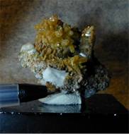
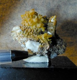
1.) Select portion of image for use (Crop) |
1.) Select portion of image for use (Crop) |
||||||||||
|
In this case the final cropping is the same for both the print image and the WEB image. It is sometimes better to select images sizes for printing which are more along standard print sizes. (4"x 6", 5" x 7", or 8" x 10") In this case the subject matter does not merit this treatment. The final image in this case is 1077 x 1121 @ 72 DPI. (14.9" x 15.5") |
|||||||||||
|
|
 |
||||||||||
|
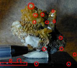
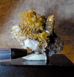
2.) Remove spots and dust from the image. Some spots are just bad reflections from the lighting, and some maybe permanent (like on the plastic base). |
2.) Spot removal same for print side. |
||||||||||
|
Some people might consider this to be unfair image modification, and if I were offering the mineral for sale I would not cleanup the highlights or small blemishes. I would let the customer see them. But since it is for reference, I do remove small blemishes and poor highlights. I use the RUBBER STAMP tool in Photoshop to selectively copy similar areas over the spots I want removed. (The RUBBER STAMP tool in Photoshop takes information from one part of the image, and duplicates it at a second position. The amount of information can be controlled by setting BRUSH SIZES in a separate menu.) |
|||||||||||
 |
 |
||||||||||
|
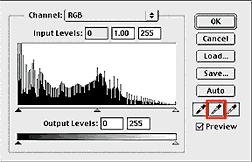
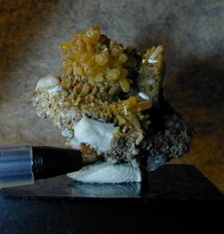
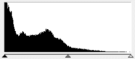
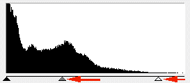
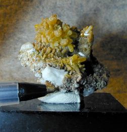
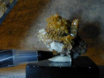
3.) Look at the HISTOGRAM of the image and modify the HISTOGRAM to give good contrast and if necessary open up any shadow areas. |
3.) Same procedure on the print image. |
||||||||||
 |
 |
||||||||||
|
The purpose of this first histogram adjustment is just to establish a full range of contrast. To set the end points so there is some true white and true black in the image, and to fix any overall central density so that the majority of the image has detail. Histogram adjustment will be done again as needed, so it is not necessary to fix everything here. The image will be changed in size or DPI resolution shortly and will fill in the newly created density gaps caused by this adjustment. Original image on the left, and after histogram modification on the right. |
|||||||||||
|
|
 |
||||||||||
|
4.) Color correction step. There are many ways to handle color correction in Photoshop. I will only show the easiest (and least precise) way in this dialogue. There are many good books with large dedicated sections on color correction with Photoshop. |
4.) Going to the commercial print world, color correction here would be handled very differently. But for my use (Ink Jet printing), I will use the same color correction a that described in the WEB portion. Again if you are going to send this image to a color printer, then you have much to read from other sources. |
||||||||||
|
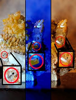
I will use the GRAY SCALE EYE DROPPER in the HISTOGRAM TOOL to set my color correction. It is easy and fast, and usually gives acceptable results. Better results can be obtained uses the CURVES TOOL, but they take much practice and have a far higher learning curve. There are three eyedroppers in the histogram window. the first is set to BLACK or maximum density, the middle is set to 50% GRAY or neutral density, and the third is set to WHITE or minimum density. I typically use the GRAY dropper and select an area on the image that should be middle gray. After clicking on my selection, the entire image is color corrected. The pixel I select as middle gray forces all pixels to be balanced accordingly. |
|||||||||||
|
As you can
easily see the position and selection of the point
is very critical to a good image. At the right are
three different selection points and their
resultant color corrections. The middle selection
point was one of the yellow crystals, and in order
to make it gray, a great deal of blue had to be
added to the image. A very bad selection. The right
hand selection was a highlight that had blue in it,
hence, the image was over corrected in the yellow
direction. |
|||||||||||
|
The first selection point was pretty much a true gray spot and did a pretty good job color balancing the image. I often look at the original mineral at this time and compare it to the screen image. If the mineral (crystal color) matches well to the screen image, I am done, I don't really care if the background matches well or not. |
|||||||||||
 |
 |
||||||||||
|
|
|
||||||||||
|
|
|
|||
 .
.